

Welcome to the {Patchwork Pennii Needle-Books & Pinni Cushions} Preview! This time, I will keep this review short and you'll find below each photo there's link or links will take you to the listing(s) if you would like to visit more.
I am quiet proud of how these patchwork pieces turn out! There are quite lots labor in love went into them. They turn out quite nicely in color combinations and each of them gets its own characteristic. Each set is used different backing fabric print, so stands on its own! There are limited and the last batch of the patchwork needle-books and pin cushions.

Brown- {145}
Browns are such humble colors in many ways. It is the color of our land, trees, nuts that we consumed/not consumed?! It is earth tone colors that some of us like/ not a fan of! I found good classic browns that I have my eyes on are chestnut, walnut, dark chocolate, Raffia is another lighter grade of brown. By giving some accent color in the brown range, I added oranges and yellow. Slightly change of the off-white to give the work more distinct.

As I shared on Instagram the other day. Blue means freedom and space to me, but when I just came to states. My friends always told me how blue they feel; such as Blue Monday. I found that interesting how we often fell in love/dislike and use colors to describe the emotion of ourselves. The blue is such a wide range of the hue; sky, Robin eggs, Peacock and ever so popular Aqua.
{cloud}
{robin egg}
{sky}
{bluebell}
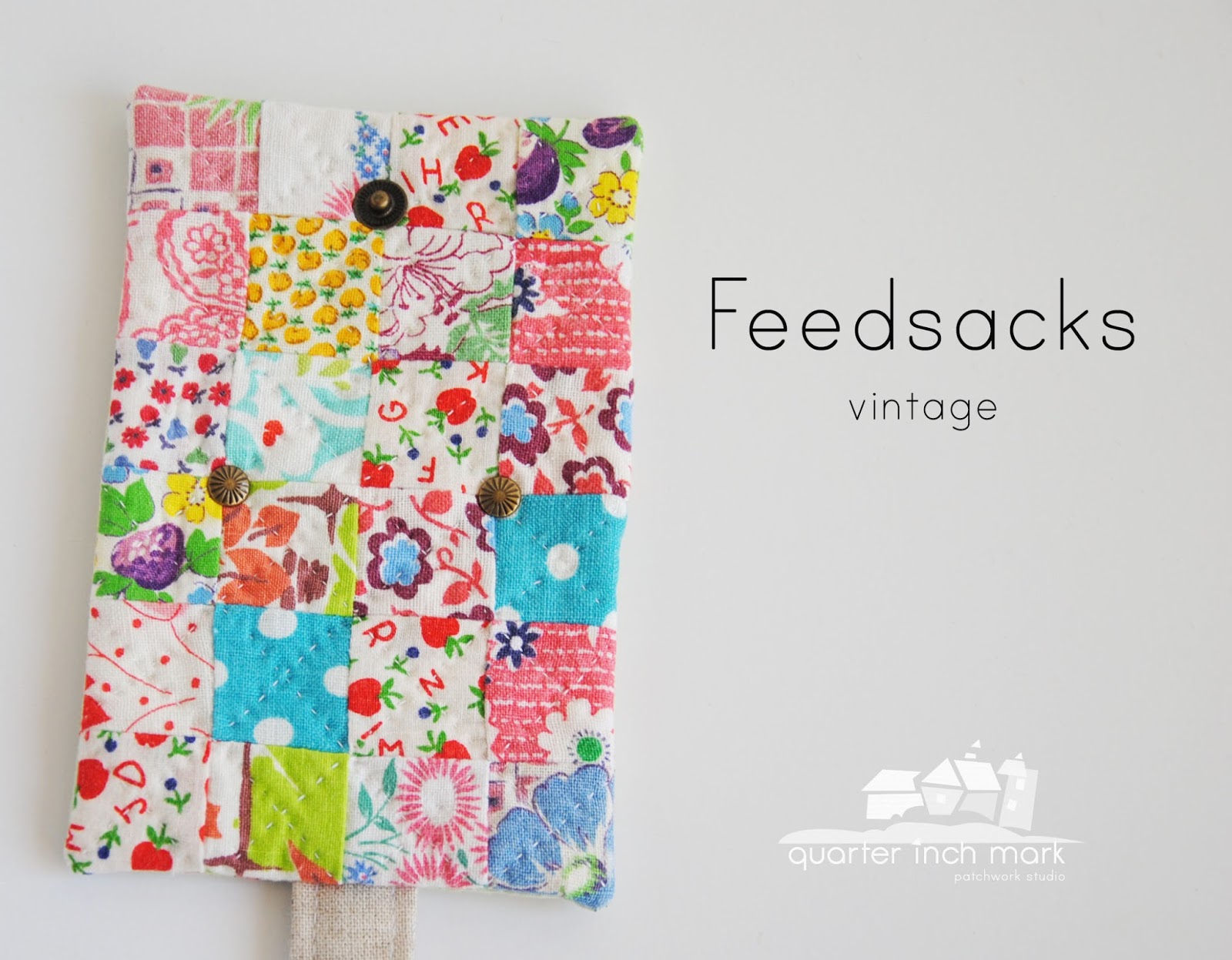
The feedsacks fabric are soft with gentle texture in them. The second best part of this fabric is great for hand-quilting. The retro colors and the floral inspired so many reprints these days. They are rare and hard to find these days now. Colors are likely faded and a few spot being stained. These prints come with its own story. Most of the feedsacks are from 1930's and later. The era, people repurpose it for making clothes for children, kitchen accessories (pot holder, aprons, etc). Nowadays, they seem like reminders and records of what were before and allow us to trace the fashion and colors back. It takes good effort to wash, dry, and press them! I admire friends who make this happen!
{vintage}

It is a neutral or we so called without color. In drawing, we use the grays by using the varies scale to bring out the object in dimensions. It is interesting to put one gray scale patch together and just to see how these tone interact. I added just little accent colors to it. I though of warm colors to bring and balance out the cold, but somewhere in my head didn't make it happen. I was in the idea of fresh and new look.
{steel}

Green is for summer?! I like how evergreen still grow and keep its color strong in the cold winter days. Green is such a energetic and full of positive color! I like how pistachio, mint, honey dew, pear, sour apple, kiwi colors flowing around in the grocery stores. For the dark contrast green; basil, hunter green catch my eye! I paired the green range with yellow and tiny red print. Used some of the fruit prints to bring out some summer colors!
{honey dew}
{pear}
{mint}
{sour apple}

The most gorgeous fabric to hand-quilt! It is such a nice and soft texture to have and work with! The colors are vivid in person and the contrast between floral prints and little icon prints make it fun to work with. It is such a pleasure to work with Liberty print.
{Tanya}

It is also called scrappy patchwork! Sometimes colors, prints in scale, and designs are accidentally match to each other! I like the idea of mix & match and always surprised by the outcome afterwards.
{random}
{mix}
{match}

My eyes go to peach kinda pink, melon, peony, and deep rose. The contrast would be fuchsia and candy pink. The soft pinks are perfect for accommodating the dark red {apple red}d, slightly mint green, and banana yellow, so on! I also found that pink goes well with grays and browns! I think it is a such tender and soft colors that could work with large range of colors!
{melon}
{peach}
{peony}
{primrose}

Purple- {146}
It is such a strange in between color! It is mixed by red and blue. Adding white to tine up and add black to give dark tones. What do you think of purple? Here are some purples that I study and enjoy; Lilac, orchid, Thistle, pansy, and petunia. These purples seem are more soft and elegant.

Red is such a strong color! Since it is such a powerful color. Likely using off-white prints will blend out the high contrast a little more. Some of soft colors and tiny print also help out this balance. The red that seem catch my eyes are apple, ruby, tomatoes.
{Apple}
{Ruby}

Yellow {142}
Yellow is the most luminous of all colors. It captures our attention more than other colors. In the natural world, yellow is the color of sunflowers. Good yellow prints are hard to find. These mustard, corn-yellow, buttercup, curry, sunflower are the yellows that appeal instantly. A color that I could use to balance with majority of prints. Orange always seems a nice accent color to that!

Thank you again for the preview! It seems hard to make just one of two sentence for all what I have been working on!
Each patchwork needle-book comes with lined with a 100% wool felt piece for the needle placement. All the hardware piece are hand installed. The closure piece is made with 100% linen piece to give extra zakka look! All the patchwork piece is hand-quilted throughout the cotton batting and patchwork itself.

These pincushions are as well being hand-quilted and added a special sewing trim on the side! Lots sweet vintage trims are being use. These cushions are stuffed with polyester filling to make them puff and soft.
Shop talk-
** Each order will be package in a sewing machine sewn none-toxic glassine paper bag to fit each book and seal with wash tape.
**At this time, I cannot guarantee the First-Class mail {$3.00} will make it to the holiday gifting. There are two shipping method now; you can select the shipping option at the check out. Shipping in flat rate priority envelope {$5.50} might be make it to your holiday gifting at this moment. All the order will come with tracking number, so we both can track the package. It has been slowing down for the postal service last few weeks, but I try to send out your order within 2 business days.
For the international shipping, First class is recommended as priority is costly for shipping the small item.
** Please do review your shipping address before you check out or after check out. Or need to ship to a different address. During this time of the year, the post office is having high volume of packages and letters to delivery. If you are ordering the item as a gift and would like to send to a different address, please do let me know in the {buyer to sender} box. Thank you so much for the double checking. I hope the package will arrive to your mailbox safely and possible on time.
Thank you for supporting my works & Enjoy~
p.s. The number that indicated within { } is the hearts that received in Instagram. It was interesting to see how we heart colors differently.
xxc
These are just fabulous! You have been a busy gal. Gorgeous, and such fine work, as usual.
ReplyDeleteJust lovely. I have to come here every day to brighten up my days. I'm just jumping up and down on the floor after seeing these beauties.
ReplyDeleteAbsolutely stunning!
ReplyDeleteThese are beautiful...you have a lovely style that makes them all look happy.
ReplyDelete